
Set Suffusion to be responsive
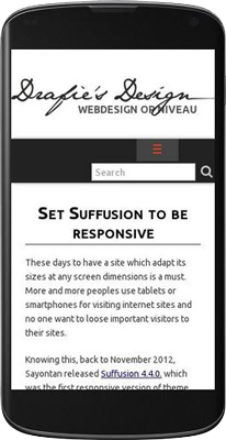 These days to have a site which adapt its sizes at any screen dimensions is a must. More and more peoples use tablets or smartphones for visiting internet sites and no one want to loose important visitors to their sites.
Knowing this, back to November 2012, Sayontan released Suffusion 4.4.0. which was the first responsive version of theme. Apart of other WordPress themes, in Suffusion the “responsivity” is an opt-in feature and is not enabled by default. Some people may prefer to have a good looking fixed site and visitors can scroll the site on mobiles.
Another characteristic, Suffusion don’t test the browser user agent for adapting the view on different devices. There are mobile devices with higher resolutions than common desktops screens. So, Suffusion display different views depending by the resolution of visitor screen. Using CSS and CSS media queries, the elements of theme are adapted to each resolution. Suffusion will not display another pages on mobiles than on desktops. The same elements (content, widgets) are arranged differently on each visitor screen.
Finally need to know that Suffusion responsive feature only HELP you to set the site for mobile, don’t MAKE the site responsive by itself. You need to think yourself the site for mobile devices. A responsive site presume to have a fluid content – without fixed elements – div’s, images, without tables. Need to prepare the header image if you use one as header foreground, also need to know that an image used as background of an element is not scaled with the element, but only cropped to the actual size of element. YOU will make the site responsive, the theme just give you some tools.
Step 1. Make your site fluid. A fixed element of 1000px will be displayed at 1000px on ALL visitor screens, the width cannot be adaptive. So, set “Fluid/Flexible widths” at Suffusion Options -> Layouts -> Default Sidebar Layout. Below set the “Maximum width” value as you prefer and the Minimum width to 0 (zero). I also always drag the slider for width to 100%. What’s means those values? They can be translated as: Make the width of the wrapper as 100% (or any value you’ve settled at Width slider) from browser viewport, but don’t exceed the “Maximum width” and don’t go below “Minimum width”.
For exemplification, let’s take a look at the default values which are 70% Width, 1200px Maximum width and 600 Minimum width. On a screen of 1366X768px will see the site at ~950px (1366X70%), but on a bigger screen like 1920X1080px, the width of the site will be 1200px (NOT 1920X70%=1344px, but the “Maximum width” value of 1200px). On the other hand, the site will be scaled down until the resolution of device reach 600px – below this resolution all devices will see the elements as they was fixed at 600px.
Now can see – by setting the site at 100% width is very simple to adjust the site for desktops – the Width will be equal with the Maximum Width. For mobiles, with 100% width, our site will fit all device screen.
The last thing you can set on that options page is the width of each sidebar. Keep in mind that on fluid layouts the width of sidebars remain fixed as is settled here, but only the width of main column is adjusted to respect the wrapper width.
If you use particular layouts for specific pages, don’t forget to make the same changes for any other particular layout you may use.
Step 2. Enable the responsive layout. Simply go at Suffusion Options -> Layouts ->Responsive Layout and tick the first option from that page. Below set the breakpoints from where the elements of the site are displayed differently. A good point to start is to let all presets as default, but only check “Resize header foreground images (logos) proportionately” if you use an image in foreground of header.
Later you can adjust everything on this options page in order to reduce the number of breakpoints for performance reasons. Each breakpoint introduce a new media query which increase the size of stylesheet.
Step 3. A bit of Custom Styles. Sometimes, when you start the customization of Suffusion with a fixed layout and only later switch to responsive&fluid layout, some of the elements remain with a minimum width of 600px. On all devices below this resolution, the site seems to not be responsive. I didn’t find a pattern, sometimes this happens, sometimes not. But is easy to address this issue by adding at Suffusion Options -> Back-end -> Custom Includes -> Custom Styles (the code try to cover all situations, not all elements are mishandled on all sites):
|
1 |
#header-container, #header-container .col-control, #nav-top, #nav-top .col-control, #nav, #nav .col-control, #wrapper, #page-footer, #page-footer .col-control, #widgets-above-header, #widgets-above-header .col-control {min-width:0;} |
Now, there are some minor bugs in the theme related to responsive layouts. Because of WPTRT policy, a new version of theme was hard to be released and these bugs wasn’t addressed. But is very easy to avoid them by using a bit of CSS.
First, the widgets from header or any horizontal widget aren’t hidden at any point, even if you select this behavior at Suffusion Options -> Layouts -> Responsive. This can be solved with a simple media query added also at Suffusion Options -> Backend -> Custom Includes -> Custom Styles:
|
1 2 3 4 5 6 7 8 9 10 11 12 13 14 |
@media screen and (max-width: 650px) { #widgets-above-header { display:none; /* to hide Widget Area Above Header */ } #header-widgets { display:none; /* to hide Header Widgets Area */ } #horizontal-outer-widgets-1 { display:none; /* to hide Widget Area Below Header */ } #horizontal-outer-widgets-2 { display:none; /* to hide Widget Area Above Footer */ } } |
The code will hide all described widget areas on any device with screen below 650px. Use only the part of code related to the widget area you want to hide. Also, change the breakpoint of 650px to any value you want.
Second, a bug in jQuery plugin which transform the menu to select list on small screens make visible 2 lists in Navigation Bar Above Header when both navigation bars are used. The first list is in fact based on the menu from Navigation Bar Below Header, which is repeated this way.
Again, a very simple CSS definition added at Suffusion Options -> Backend -> Custom Includes -> Custom Styles will solve the problem:
|
1 |
#nav-top .tinynav:nth-of-type(1) {display:none;} |
or
|
1 |
#nav-top .tinynav:first-of-type {display:none;} |
Finally, you can install my plugin Suffusion Collapse Menu which will replace the select list with a “menu button”, solving the problem of duplicated lists, but also solving a problem with “home” icon which in original select list disappear letting just a blank option instead.
Ciprian
Experienced web developer and graphic designer. Former consultant for Suffusion theme and former moderator on Suffusion Support forum. I teach others while learning myself.

Hi OpaJaap,
Thank You for visiting my site, I am a big fan of you and your plugin from years. I use WP Photo Album Plus plugin on several sites since I discovered it years ago. GREAT!
I just installed Suffusion on bundlejoy.ro and settled it to be responsive, following exactly the steps from the article, excepting that I’ve added the CSS to “Edit CSS” from Customizer, not in Suffusion Options.
The site is also running on PHP 7.2.
Everything works, the site is working on mobile devices without problems.
An usual advice which I gave to all users of Suffusion before starting adjustments, is to go at Suffusion Options -> Backend -> Site Optimization and select: “Auto-generate the CSS and print it in the HTML source (Least load on server, ugly page source code)” at the first option. This will reduce the stress of server and of user which will not deal anymore with cached files.
If you have time, you can activate the theme on your site, letting me to take a look with Inspect CSS to see what’s happens.
Thank you very much,
Ciprian
P.S. – Yes, I saw the warnings generated by Suffusion, but right now the theme still works.
I am a developer of wp plugins and recently discovered the existence of theme suffusion.
I tested it on 3 testsites. The problem is that i can not get it to be responsive on 2 out of 3 sites.
I ticked the fluid checkbox and enabled responsive layout.
I even verified the settings:
‘suf_wrapper_width_type’ => ‘fluid’,
and
‘suf_enable_responsive’ => ‘on’,
I tried version 4.4.9 and 4.5.0
I run php 7.2 and get a lot of errors like:
Methods with the same name as their class will not be constructors in a future version of PHP; Suffusion_Widgets has a deprecated constructor in …/wp-content/themes/suffusion/widgets/suffusion-widgets.php on line 10
and
al lot of non-welformed numbers.
I wanted to convert my doc site (see link below) to suffusion but i do not get it responsive, so still on theme twentysixteen
Can you help me, please?
Hi Andreas,
Thank you for visiting my site.
In the responsive mode of Suffusion the sidebars can go below the content or they can be hided completely, at some breakpoints, from Suffusion Options -> Layouts -> Responsive Layout. ALL sidebars (1 or 2, how many are settled at Layouts), but not only some of them.
This site is settled with only one sidebar, on the right – so, only this sidebar is going below the content.
Hello Drake,
I see, that your right sidebar disappears, when I make the browser window size smaller. In the Suffusion-settings I can only make BOTH sidebars disappear. Can you tell me, how you made it work?
Thank you very much
Andreas
Hi
I am have decided to go for the responsive option.
I user different headers per category and they all look to wide http://celtic-hub.com/Paradise/category/nyc-bhoy/
How can I alter this so as the headers are not too wide?
Also if you scroll down I have an ‘extended recents posts widget’ but the width of that is not right either
Lastly I am using intense debate as my comment plugin but when I look at my site on my phone it seems to show only the standard wordpress comment box
Can you help please Drake?
Hi Joe, glad to hear that you solved the issues. Yes, Suffusion cannot manage images in menus on mobiles (even Suffusion “home” icon is loosed on mobiles) and my plugin solve only this problem of native “home” icon, other images will break my menu too.
It worked! Thanks! I removed two image elements I had on two menu items and it worked!
Thx man… it worked but it seems that theres something with the menu still.
Hi Joe, thanks for visit,
From outside, your site still look like it have a fixed width of 1000px, while it need to be settled with a fluid width for being responsive (step no. 1 from the article).
1. You use W3TC and the caching plugin will serve cached pages which not reflect the actual changes. While you make the adjustments I suggest to clear the cache from Performance tab, disable caching from W3TC then disable completely W3TC. (If you also use Cloudflare services with W3TC, go and enable Development Mode and purge the cache of Cloudflare).
2. Select “Auto-generate the CSS and print it in the HTML source (Least load on server, ugly page source code)” at the first option from Suffusion Options -> Backend -> Site Optimization (always select this option as will free the server and the styles will be served in real time, not from a file which can be eventually cached).
3. Make now all adjustments from article.
4. Re-enable W3TC, but NOT enable Minify checkbox at Performance -> General Settings.
Not sure I did anything wrong but mine on a mobile doesn’t show right… it shows two menus, one under the other… besides it shows a list with each menu item as wide as the width of the page… I installed the Suffusion Collapse Menu plugin… can you take a look? technoloman.com is the site… thanks.
Yes, it is possible. Take a look at http://css-tricks.com/css-media-queries/ to see how can use media queries and apply them to the elements from my previous comment.
That worked perfectly. Thank you again.
I had an idea and wondered if it was possible.
At 480 have the tile excerpt whitespace removed.
At 320 have the tile excerpt removed leaving just the titles.
I have a picture to explain. http://oi57.tinypic.com/16j3x1.jpg
I’ve done some experimenting but no luck so far. Can this be applied to the image above tiles also? For example: hide the image (thumbnail?) above tiles at 550px and under.
(slightly off-topic, is it possible to reduce the amount of white space at the bottom of the tiles under the excerpt?)
Thanks again for taking the time to help. I try to figure it out myself before asking, but I don’t seem to have a head for css.
Yes, it is possible. For hiding thumbnails:
The first line of code hide thumbnails in tiles, the second line try to adjust the height of tiles to compensate the height of missing images, but also try to change the space below tiles. You have to adjust padding and margin until will fit your needs.
That’s very true. Thanks again for your help.
Can change the font size also by CSS (use desired size in the code below):
About iPhone, I cannot say anything, Suffusion don’t look for the browser user agent to see if it is an iPhone or a Samsung or anything else… the look is adjusted only depending by the resolution of screen. I don’t know how iPhone works, but a site is just a site, it need to stay INSIDE the browser… It cannot cover anything else what the browser don’t cover… Maybe she have enabled a “full screen” mode, as you can obtain in Chrome by pressing F11.
Thanks Drake. The article was helpful too.
Just two more problems:
1. The word “menu” is way too big. How can I make the type smaller?
2. My sister has an iPhone 5s and the website overlaps her entire screen, including the time, battery % up top, web address etc. When she opens the site she can’t use the browser at all. Is there a fix for that?
Hi Annie, thanks for visit.
1. For mobiles homeicon I found this article useful: http://www.kylejlarson.com/blog/2013/adding-an-icon-for-iphone-ipad-android-to-your-website/
2. The toggle button use the background settled for the regular menu from Suffusion. The color of lines can be changed adding at Custom Styles:
(change blue – #0000ff – with your color)
By CSS you can change even those 3 lines to other html character or to a short word:
Even the background can be changed for the button, also by CSS added at Custom Styles:
(Again, use your own color instead of green – #00ff00)
3. No, I’m afraid that not exist an easy way for doing this, the elements are added in the markup of theme, and naturally flowing in this way. Maybe with some javascript can be changed the flow.
Yes, I know this behavior of featured slider index and unfortunately Sayontan didn’t find a solution for it. But you can ignore this problem, no-one come on your site to make tests for your responsive design. Only us, the developers, shrink and enlarge the browser window, our users come from desktop – see the site as it should to be on desktop, come from mobiles, see the elements already rearranged for mobile…
This is great! The site looks absolutely wonderful on my phone, keeping all of the styling and branding of my site. Love it. And your plug in definitely improves it even more.
Three questions:
1. How can I set the icon that will appear when someone saves the site onto their home screen?
2. Can I change the look of the menu button that appears on the top after activating your plugin?
3. Is it possible to place some of the sidebar widgets right before the posts instead of all of them at the bottom?
Thank you!!
That worked perfectly. Thank you very much!
While we are talking about responsive layout and featured content I have another issue.
Whenever I resize the browser causing the featured content to shrink or enter/leave a breakpoint – the bullet/numbered index doubles. i.e I’ve resized the broswer entering and leaving a breakpoint 12 times creating 36 bullets instead of the 3: http://oi59.tinypic.com/29atzqb.jpg
Hi Jason, thanks for your visit.
Yes, it is possible to hide any element using media queries. For the static featured content slider (settled at Other Graphical Elements) can use:
If your slider is added in a widget can try with:
(For hiding a specific widget need to find the id of the widget with Inspect Elements – something like “suf-featured-posts-XX”, XX being a number assigned by WordPress – and address #suf-featured-posts-XX in the media query)
First.. I’ve used some of your custom include tips already and they work wonderfully.
Second.. my Responsive Layout question: Is there a way to make the Featured Content section be hidden at a breakpoint?
For example.. from 650 breakpoint and below the Featured Content is hidden?